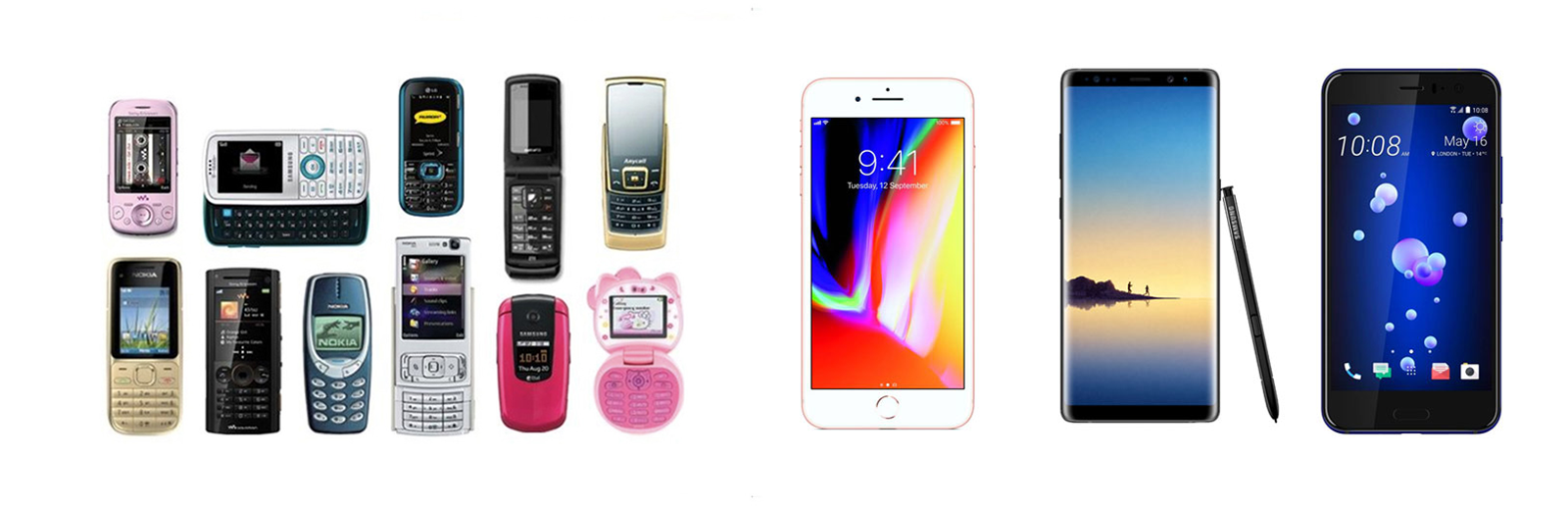
As most of us at the current time still remembers how mobile phone(s) used to looks so different, they were maybe more fun, but all seems targeted to the different segment of the general public. This doesn’t last long after Apple launch their iPhone; and ten years after the battle between different companies, it looks like all the mobile phones look the same. For me, this can be explained by two major factors.
1. The current mobile phone has fulfilled the “Maslow of hierarchy needs”, the basic functions are eventually “solved” by the advancement of technology and emerging of new materials.
2. Commoditization of the mobile phone industry.
As some might treat this as a step-back on creativity or imagination, we shouldn’t forget that this comparison is between the consumer-based marketable mobile phones. If we just look broader, we might look a much wider horizon and deeper impact on how future mobile phone have in our lives, for examples, the bending display technology, VR or AR integrated technologies and A.I. based service might in the near future again revolutionalized how phone looks like.
At this post, I want to focus on the Industrialisation of interface design.
First journey to industrialize the interface design
One of the most modern examples of the industrialization of User Interface Design is how Dieter Rams treated the Braun radio and sound system’s interface.
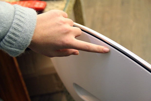
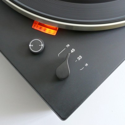 During the 35 years in Braun, Dieter has led the team with the core design ideology, “less, but better”. Under this ideology, he has designed 514 pieces for Braun, shaped how the physical devices’ user interfaces look like from 50-90s and trailed all the way to modern age today. His work not only defined the iconic radio/sound system UI look in that age, but it also sets a standard for today’s design; it also means that we spend the less time discussing how the volume knob should function and look unless it has a significant impact on the users. This kind of standard, or “Archetype” in design, laying the cornerstone for more innovative design work; by building on common sense, the designer has the opportunities to expand their ideas and creativities on the already stress-tested features. For examples, Øivindes B&O Play A9 volume knob is essentially the enlarged volume knob, but combine on the new sensor technology, it works effortlessly.
State of the current digital UI design
The current UI design, from where I see it, is also on the same course. Until 2010, designers and engineers were trying to come up the archetype for the digital user interface. The Design system/language trends are growing faster than ever at the moment, but the standards seem are settled. There are so many best practices have been stress tested and user validated, so there shouldn’t be an excuse if your next UI project could not be a success. This has certainly shifted the focus of interface design now. This can be seen both in agency side and client side.
1. For the agency side that more and more design agencies are not only providing a product based solution but more methodological design thinking process; delivering assets and templates are becoming less value but more and more digital design agencies choose to deliver design system.
2. For the client side, we see more and more enterprise-level companies are building their own Digital Design System to manage and govern the ever-growing business.
I think this wide shared ideology(Design System) and methodology(Design thinking) are just the starts of industrialization of User Interface Design. The digital designer should be able to speak and translate design language, business language and design language across the organisation; the digital designer inside an organisations are not only the pushing pixel around, a lot of industrialised tools such as site builder or freelance platform can easily solve a lot of the business and user challenges. A good digital/UI designer could and should provide more than the end implementation service, it should be a translator and ambassador between different disciplines.
Why the industrializing interface design is important? And why should designer concern about it?
When a designer is committed to a project at a fixed rate, it is natural to balance the solution quality inside the cost range. In the long run, you would think designer provide better and better solutions for quality, right? Maybe, we have to consider that each project’s request and goal is different from each other; the condition for the designer to work under can also be different; at last, the design also contains the unexpected but expected learnings and creativities. Under so many uncertainties, the designer can sometimes struggle with closing the project with the quality they trust on time. This is where I believe the industrialized interface design can help us archive our goal on time with better quality. The Industrialisation of Interface Design might not turn all the uncertainties into certainties, but it provides an equal foundation between clients and designer to discuss what the possible outcome they expected, and how to reach that result. In a short version, if we can omit the discussion for certain industrialized UI element, we can focus on identifying the real challenges and therefore providing unique design solutions.
It removes the unnecessary frictions from different teams, so they focus on learnings and build.
There are 3 stages, where the industrialized UI design can remove most the frictions during the design process.
In the early stage of the UI design project, before you rip the design brief. The unnecessary frictions can often rise by ignoring the widely accepted best practices, not by purpose, but just simply because moving too fast and forget to do so. Some projects might require us to rethink the whole navigation structure, but if it is no the case, it never hurts to watch and understand how the others achieve the same navigation principle. There are some online resource you can check out, UX pin book libs, unheap, google material design.
During the designing stage, the unnecessary frictions can be the missing of proper management between experiment and the design documentation. In order to gain insight and implement learnings from your creative process, it is important to know what the design experiment is, and what the design document is.
- The design experiment is targeted for designers and end users, this is where your team and end-user can exchange ideas, it is where the insights emerge, and it is the time to layout different decisions and options.
- The design documentation is targeted to designers and clients, this is where your team can present the insights to your client, with a good documentation provided, this is often when your team can narrow down the options and progress the product development.
With so many stakeholders involved, it might be hard to further cut down the frictions. So the priority for me is always knowing when to isolate the design experiment and find the appropriate way to document the experiment outcome. My last post have tried to give some ideas on how to can reduce the frictions by using sketch app, so if you often find yourself tangled with different versions of “final version”, go ahead and give sketch app a try.
At the closing stage, the unnecessary frictions often emerges when designer forgets to include the industrialized states in the design element. The user today are expecting premium digital solutions, from a service based app to a product website. The main ingredient for the designer to turn the UI design to a premium solution is often to complete all the states for the UI element. Our design often starts with the most default states, but it doesn’t mean it should end with the default states. It is equally crucial to include the empty states of a list container design. Some of the edge case scenarios might not be so edgy when you layout the entire user journey/customer journey because you should anticipate the users/customer encounter your solution in different scenarios. We already have the basic industrialized states for buttons, such as default, hover, pressed, focused and disabled, today we might only practise these states in some of the buttons, but I believe follow this principle we should really re-consider our UI design documentation, so we are not leaving the developers alone in the spotlight and expect magic to happen.
The industrialized UI design also will change the role of creativity in the organization.
Based on this shift of friction, it also impacts how an organization approaches the creativity today. The creative process has always been a collective activity, but it becomes more and more important for an organization to progress. Today the creativity is not about thinking outside the box, but the creativity is to ensure the low friction when organization before, during and after thinking outside the box. The creativity today is to ensure that we still have the energy and clarity to learn and execute while we are building the solution.
Digital designer should push more than Pixel in the creative process.
The streamlined and automated process sometimes means selections, the market today will select those who adapt best. Digital designer today should be very selective on what ownership he/she should take in the creative process. The designer should focus on the area where the project needed most. The discussion on what typeface we should use, or what color palette we should combine, or what layout principle we should choose can be equally important if we can reduce the friction between different department. But we should definitely focus more on the higher order above the typefaces and colors, it is the ability to translate our visual language to different language; it is also the ability to communicate our proprietary knowledge effectively across the department because this will eventually generate meaningful debates, questions, and answers.